Table of Contents
Team Dashboards Overview
Monitor team progress, manage risk, and support agile retrospectives using the real-time insights provided by Team Dashboards.

Team Dashboards provide a real-time view of your team’s delivery, quality, and workflow health. They are designed to help teams quickly identify risk, understand in-flight work, and continuously improve delivery practices.
You can switch between teams and iterations using the selectors at the top of the dashboard.
Dashboard views
Team Dashboards support two complementary views:
- Current Iteration — an operational, in-flight view of work happening right now.
- Retrospect — a historical view designed for sprint or iteration reviews.
You can switch between views using the iteration selector at the top of the page.
Current Iteration view
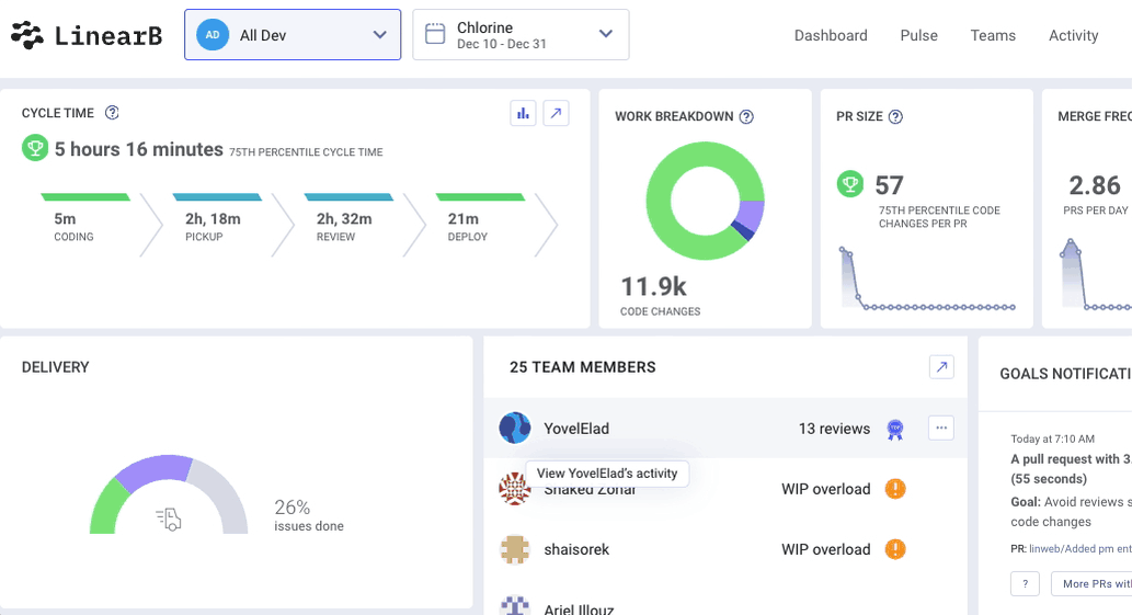
The Current Iteration view focuses on active work and daily delivery signals. It highlights in-progress branches, cycle time, workload distribution, and goal status.
Cycle Time
Cycle Time shows how long it takes your team to move code from pickup to deployment. Values are displayed as an average or percentile, depending on your account configuration.
Each phase is interactive:
- Coding
- Pickup
- Review
- Deploy
Clicking any phase opens the Activity view, filtered to show the branches contributing most to that stage.
📘 Learn how LinearB calculates Cycle Time
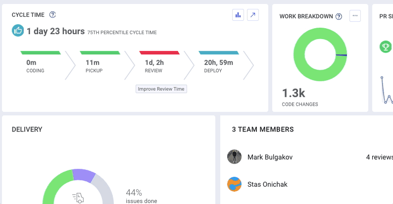
Work Breakdown
The Work Breakdown widget visualizes how code changes are distributed during the current iteration or week.
- Click the graph icon to explore breakdowns from previous iterations.
- Click the branch list icon to view the full list of contributing branches in the Activity tab.
Breakdown categories:
- New Work — Newly added lines of code
- Refactor — Changes to code older than 21 days
- Rework — Changes to code less than 21 days old
Customizing top widgets
You can customize the three widgets in the top-right corner of the dashboard to highlight the metrics that matter most to your team.
Click the pencil icon on any widget to select up to three metrics. This helps teams stay focused on current priorities and KPIs.
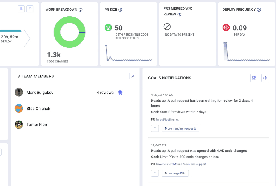
Team Members
The Team Members section lists all contributors in the team. When individual metrics are enabled, selecting a team member opens their activity and branch details for the selected time range.
🔗 Learn how to enable or disable individual metrics
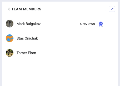
Status indicators:
- Burnout Alert — Triggered when a developer works 90% or more of sprint days (starting from Day 6).
- WIP Overload — Indicates more than six active branches.
- Top Reviewer — Highlights the team member with the most PR reviews in the current iteration.
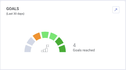
Goals and notifications
Team goals are visualized directly on the dashboard. Hover over any flag to view goal details.
- Green — Goal is being met
- Orange / Red — Goal is at risk or not met
Click the gear icon to manage goals or open the Team Goals Report.
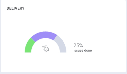
Delivery
Delivery metrics appear once a project management (PM) board is connected in Team Settings.
The widget shows the percentage of issues in To Do, In Progress, and Done states.
Clicking a segment opens related ticket activity in the Pulse view.
Retrospect Iteration view
The Retrospect view is designed for sprint and iteration reviews. It provides a historical, analytical perspective rather than an operational one.
This view highlights trends, summaries, and outcomes from the completed iteration, helping teams reflect on performance and identify improvement opportunities.
Metric summaries and trends
- Reviews — Total PR reviews completed, including average comments per review over time.
- Deployment Frequency — Number of deploys per day and total deploys during the iteration.
These insights support structured retrospectives and data-informed improvement discussions.
How did we do?
Team Dashboards - Team Only Mode
⭐️ Teams Overview (Start Here)